Hexagon design system
A ground-up redesign of an enterprise design system built to scale AI-first products, reduce tech debt, and empower teams to move faster.

Role
Sr. UX Designer - Design System
Company
AWS - Amazon App Studio
Duration
3 months
Background
Hexagon is the design system behind App Studio, an AI-first, no-code/low-code product for app builders. As the product matured, it became clear the system needed to grow with it. The visual design no longer matched where the product was headed, AI tooling and Amazon Q integration were on the horizon, and aligning with the AWS tech stack meant design tokens were no longer optional. Across the broader engineering org, which was scaling fast across multiple products, a reusable and sustainable foundation wasn't a luxury but the only way to keep up.
Goals
Evolve Hexagon to support AI-first workflows and Amazon Q integration.
Keep the system true to its purpose, flexible and approachable for no-code/low-code users.
Launch light and dark mode informed by Honeycode (the previous product iteration of App Studio) user research.
Build an open-source contribution model with real governance, so the system could grow beyond one person.
My Role
The visual direction came in as a home page/dashboard mockup, so my first job was reverse-engineering the design direction into a scalable component library with only a handful of components. I had to do a lot of filling in blanks and judgment calls, which required knowing the existing system inside and out while keeping a clear eye on where it needed to go.
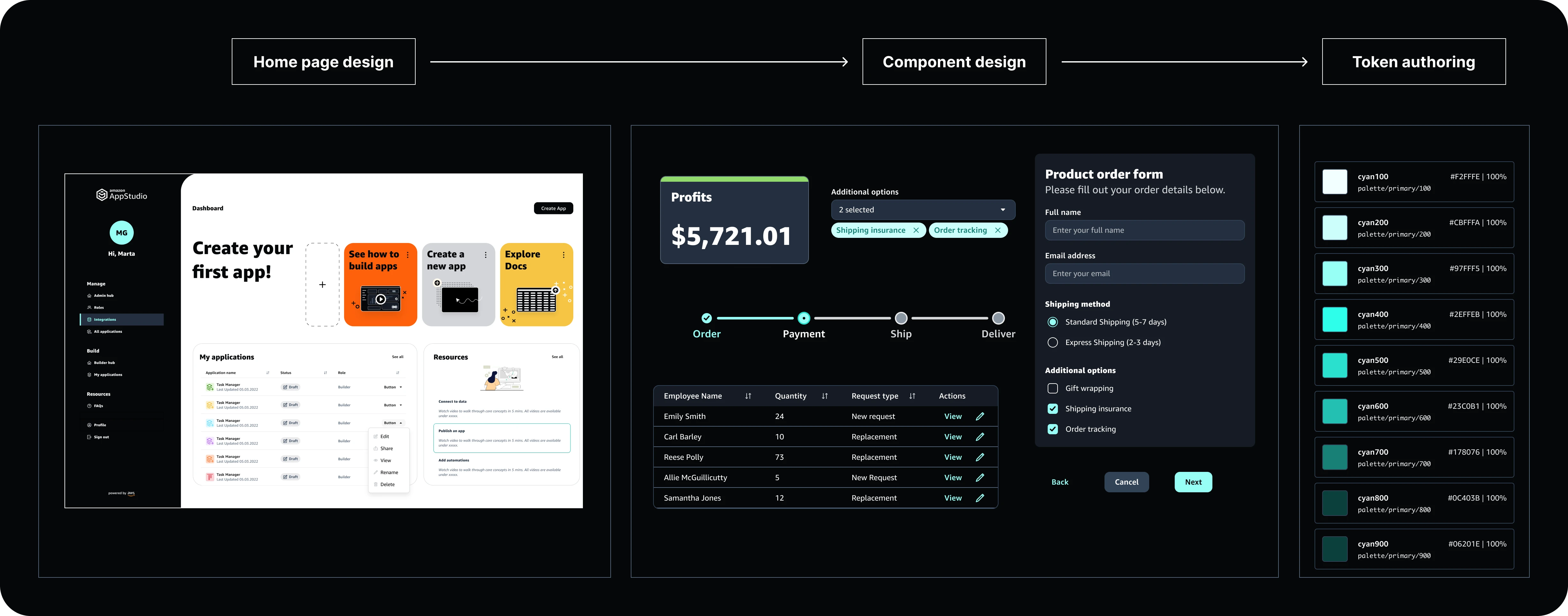
In parallel, I partnered with engineering to build the token library from scratch in Figma Token Studio, with light and dark mode baked in from day one. It was as much a collaboration as it was a design exercise. Getting the token structure right early was absolutely necessary because of tight timelines and an evolving product.
I also cared a lot about adoption so I recruited and mentored 4 design ambassadors, ran office hours twice a week, attended UX reviews, and stayed available for quality checks and handoff support. Building the system was only half the job. Building up a proper governance system was key to Hexagon's open source model.


Process
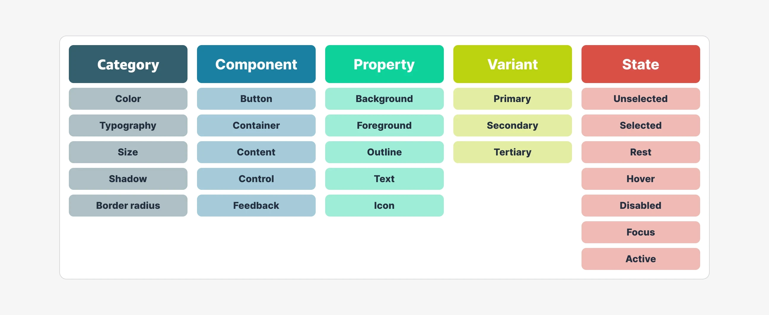
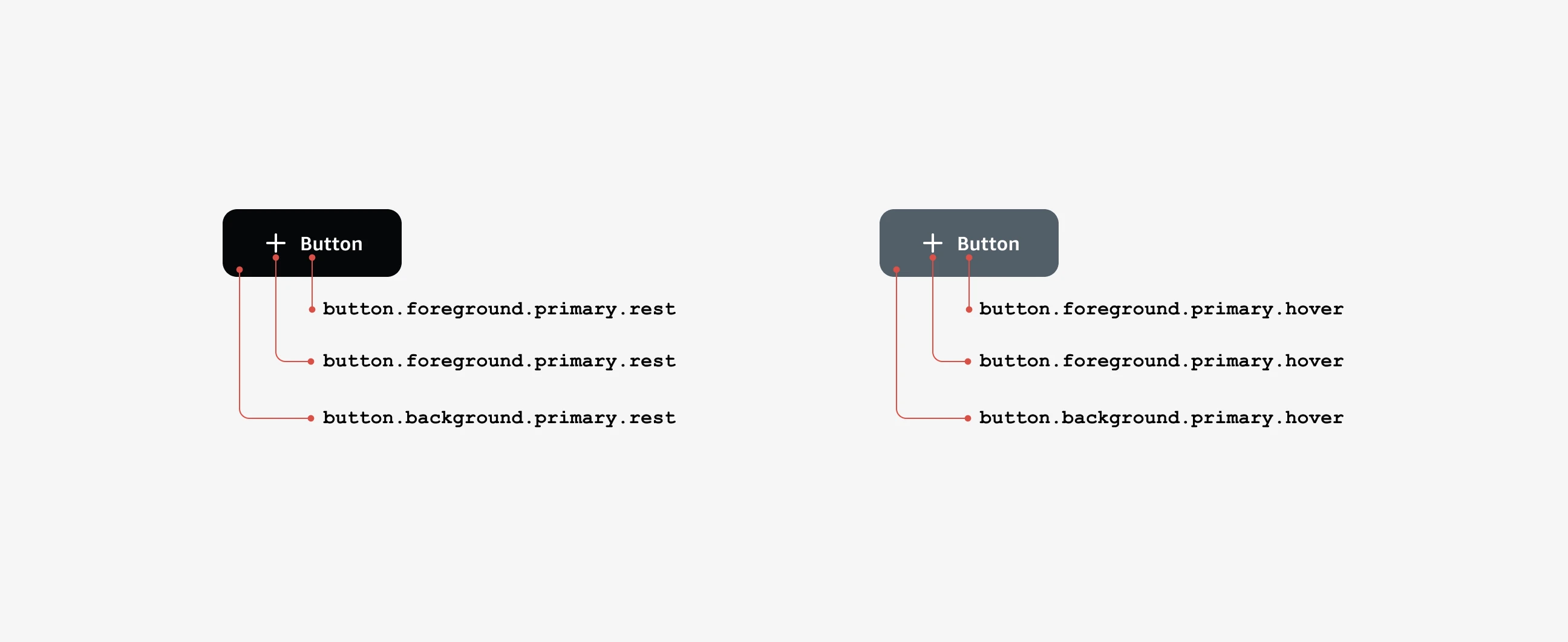
First I gathered up components from the current, older system and bucketed them into groups based on the component type, such as feedback, container, button, etc. Since feedback in this system is tied to set status colors (e.g. red is error, green is success), I found this to be a good start to write design tokens based on patterns identified in colors and sizing.
I worked with my engineering partner to identify a templated structure for the tokens that would work in the current code base and got to work writing sets of tokens for the current system. This helped inform me on how to structure and organize the tokens for the updated newly designed system.
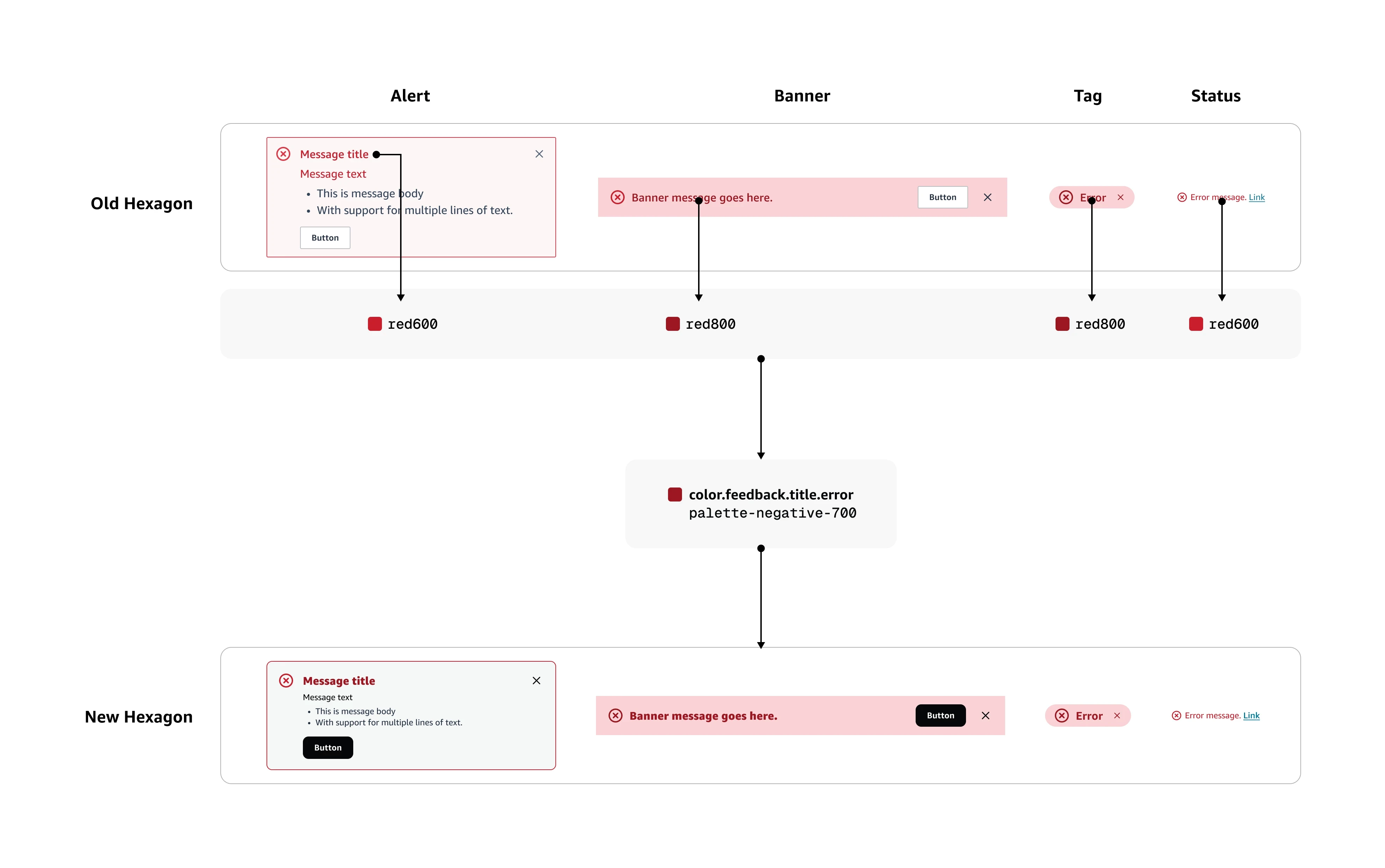
Once I had a good base of component specific tokens written for feedback components, I started redesigning the system based on the mocks from the visual designer and with the newly created semantic tokens in mind. By going through this exercise, I took inventory and looked at what could be simplified from the old system into the new. Does a success message green need different shades of green or can it be one darker accessible green that can work on lighter backgrounds? By approaching the new design with this lens, I was able to create a lean and consistent update to Hexagon in both light and dark mode.
Outcomes
Hexagon shipped as a core part of the App Studio launch. Two additional teams adopted it, which was a strong signal the system had legs. That expansion was later paused due to business reprioritization, not anything on the system's end.
The token structure alone saved hundreds of developer hours by cutting redundant styling work and chipping away at long-standing tech debt. That kind of impact is easy to overlook until you see it at scale.
The outcome I'm most proud of is this: when App Studio was sunset, the work we'd done with tokens was compelling enough that leadership brought me onto a new team to keep building on it. The product ended but the system's impact didn't.
Other projects

Continuum design system
A scalable design system rebuild for Amazon Quick focused on getting components right, reducing engineering debt, and unlocking AI-assisted tooling.

Frenchi App
A personal exploration of an app to help manage my three french bulldogs.

App Theming
Upgraded custom app theming experience based on customer feedback